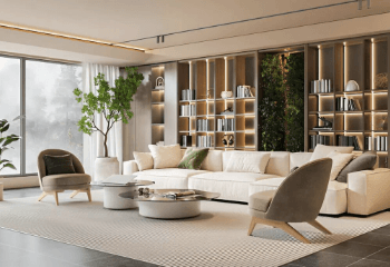
A fresh coat of interior paint can completely change the atmosphere of a home. But while trendy colors can make a room look great in photos, homeowners in Ohio need to think about more than appearance. Everyday traffic, changing indoor humidity, natural light, and frequent cleaning all affect how paint looks over time.
For homeowners working with Painters in Norton Ohio, the goal should be finding a balance between current design trends and finishes that continue to look good after years of normal use. Here are some of the interior paint trends worth considering in 2026—and what actually makes them practical for Ohio homes.
Warm Neutrals Are Taking Over
Cool gray interiors have been popular for years, but warmer neutrals are becoming a preferred choice for homeowners who want rooms to feel comfortable and inviting.
Colors such as warm white, beige, taupe, mushroom, and soft greige can work well throughout a home. They provide a flexible background for furniture, flooring, artwork, and seasonal decorations.
One advantage of warm neutrals is that they tend to remain appealing even when design trends change. They can also make rooms feel more welcoming during Ohio’s darker winter months.
Earthy Greens Bring Nature Indoors
Green continues to be a popular interior color, particularly softer shades inspired by nature.
Consider:
- Sage green
- Olive
- Muted moss
- Soft eucalyptus
- Gray-green
These colors can work particularly well in bedrooms, home offices, bathrooms, and living rooms. They pair naturally with wood flooring, natural stone, plants, and neutral furniture.
Rather than covering every room in a strong green, homeowners can use it on one feature wall or in a smaller space for a subtle update.
Richer Colors Are Making a Comeback
Deep colors are becoming more common in modern interiors. Navy, forest green, charcoal, and warm brown can create depth and personality when used correctly.
These shades work particularly well in dining rooms, libraries, offices, bedrooms, and powder rooms.
However, lighting should always be considered. A dark color can look completely different in a room with limited natural light compared with a bright room facing large windows.
Before committing, paint a sample section and observe it at different times of the day.
Soft Whites Are Replacing Stark Whites
White will always have a place in interior design, but many homeowners are moving away from extremely bright, cool whites.
Soft whites with subtle warm or neutral undertones can create a cleaner appearance without making a room feel cold.
The important thing is to compare the paint with existing features. Cabinets, flooring, countertops, and trim can all influence how a white appears.
A shade that looks warm in one room may appear noticeably different in another because of lighting.
Color Drenching Creates a More Cohesive Look
Color drenching involves using similar or matching colors on walls, trim, doors, and sometimes the ceiling.
This technique can create a sophisticated and intentional appearance. It works especially well in bedrooms, offices, dining rooms, and smaller spaces where homeowners want more visual impact.
However, preparation becomes especially important. When walls and trim are painted in similar shades, imperfections may be easier to notice. Cracks, dents, and uneven surfaces should be addressed before painting.
Washable Finishes Make Sense for Busy Homes
Color isn’t the only factor that matters. The finish can determine how practical a paint job is.
Homes with children, pets, or heavy foot traffic may benefit from washable finishes that can handle occasional cleaning.
For example:
- Bedrooms: Low-sheen finishes can provide a soft appearance.
- Living rooms: Eggshell or similar finishes can balance appearance and durability.
- Hallways: A washable finish can make maintenance easier.
- Kitchens and bathrooms: More durable finishes are often practical because of moisture and cleaning.
- Doors and trim: A tougher finish can help resist everyday scuffs.
The best choice depends on the room, surface condition, and manufacturer’s recommendations.
Accent Walls Are Becoming More Thoughtful
Accent walls haven’t disappeared, but homeowners are becoming more selective about where they use them.
Instead of choosing an extremely bright color simply to create contrast, many are using deeper, sophisticated shades such as muted blue, olive, charcoal, or warm terracotta.
A good accent wall can highlight a fireplace, bed, built-in shelving, or architectural feature without making the entire room feel busy.
Don’t Ignore the Ceiling
Ceilings don’t always need to be bright white.
A soft cream, pale blue, light beige, or another subtle shade can add dimension to a room. In spaces with interesting architectural details, a painted ceiling can make those features stand out.
However, ceiling color should be considered alongside wall color and natural lighting. A strong contrast can make a ceiling feel lower, while a similar color can create a more seamless appearance.
What Actually Holds Up in Ohio Homes?
A paint trend is only useful if it works with the way a home is actually used.
Ohio homeowners should prioritize:
- Proper surface preparation
- Quality paint appropriate for the room
- A suitable finish
- Good ventilation during and after painting
- Proper drying and curing conditions
- Regular but gentle cleaning
Preparation is especially important. Painting over dusty, greasy, cracked, or damaged surfaces can lead to poor adhesion and an uneven finish regardless of how expensive the paint is.
Experienced Painters in Norton Ohio can evaluate existing surfaces and determine whether cleaning, patching, sanding, or priming is necessary before applying the new color.
How to Choose a Trend That Won’t Feel Outdated
You don’t have to avoid trends completely. The trick is knowing where to use them.
For larger rooms and frequently used spaces, timeless neutrals can provide a foundation that lasts. More adventurous colors can then be introduced in offices, powder rooms, bedrooms, or accent areas.
Before choosing a color, consider how it looks with your existing:
- Flooring
- Cabinets
- Furniture
- Countertops
- Natural lighting
- Trim
It is also worth testing paint samples directly on the wall instead of relying entirely on a small color card.
See also: Challenges in Tracking Data Movement
Final Thoughts
Interior paint trends for 2026 offer plenty of options, from warm neutrals and earthy greens to rich accent colors and softer whites. But the best choice isn’t necessarily the trendiest one.
A successful interior painting project combines current design ideas with practical considerations such as durability, lighting, room usage, and surface preparation.
If you’re planning a project, Painters in Norton Ohio can help you evaluate those factors and choose an approach that looks current while remaining practical for everyday life. The result should be a home that feels fresh today without requiring another major update a year or two from now.